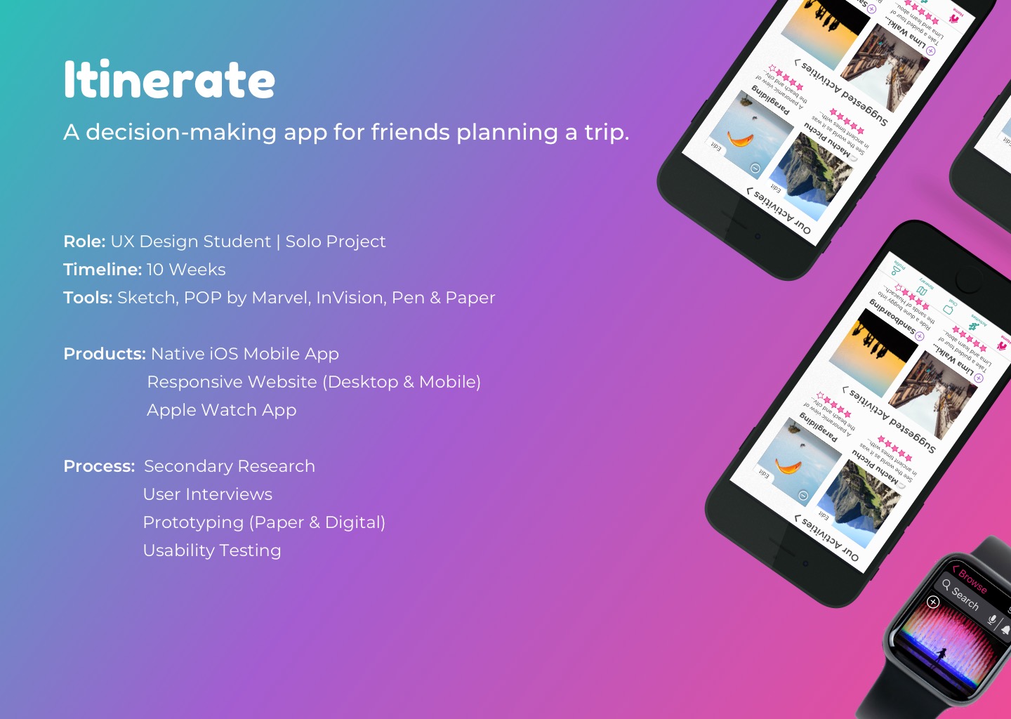
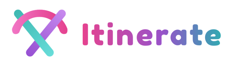
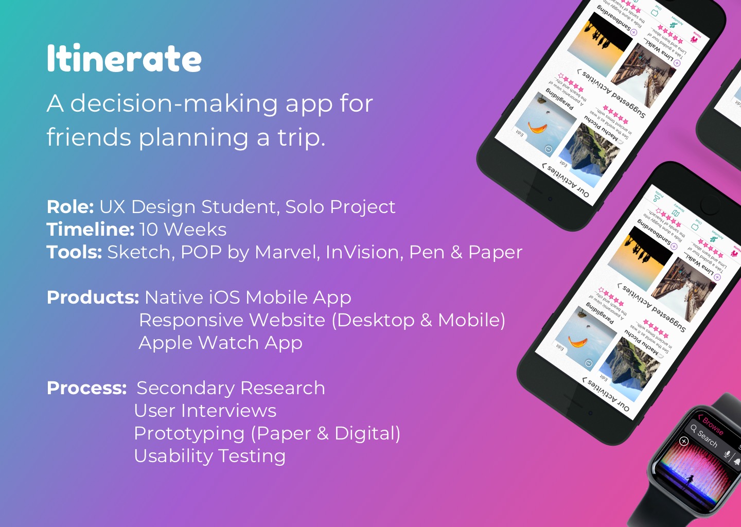
Itinerate
Using a human-centered approach, I created a mobile app to solve the problems associated with planning a group trip. It incorporates a simple voting system where friends can choose and vote on activities together. The app can then generate an itinerary for the group, reducing pre-trip stress associated with group planning.
User Interviews & Usability Testing
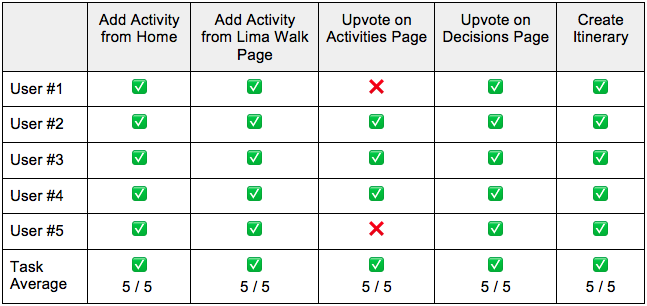
• Combined User Interview (short) and Usability Testing into one session for each of 5 users
⇨ This saved on time, resources, and simplified logistics in terms of scheduling users volunteering for free
• Users are clients utilizing ECHS’ services in some way, or having had experience within the U.S. insurance space
⇨ 2 Customers (with focus on employers who need insurance for their employees)
⇨ 3 Agents selling ECHS solutions to customers
⇨ Instead of getting 5 of each type of user, we simplified this as above to save on time and resources, but also because agents serve customers, then we are ultimately working towards getting the customers’ needs met first while ensuring agents can help their customers.
⇨ We also didn’t want to rely solely on the assumptions of the agents for what customers wanted, so we included the customers to get their needs straight from the source.
⇨ To note, marketing goals shifted more towards focusing on helping agents at this point (as stated by stakeholders), while UX goals didn’t lose sight of the customer.
Design Challenge
For my 10-week design challenge at BrainStation, I was tasked broadly with finding a problem space and coming up with a solution. I decided to tackle issues surrounding travel, as it is a passion of mine, and I thought it'd be cool to help more people get out there and explore the world!
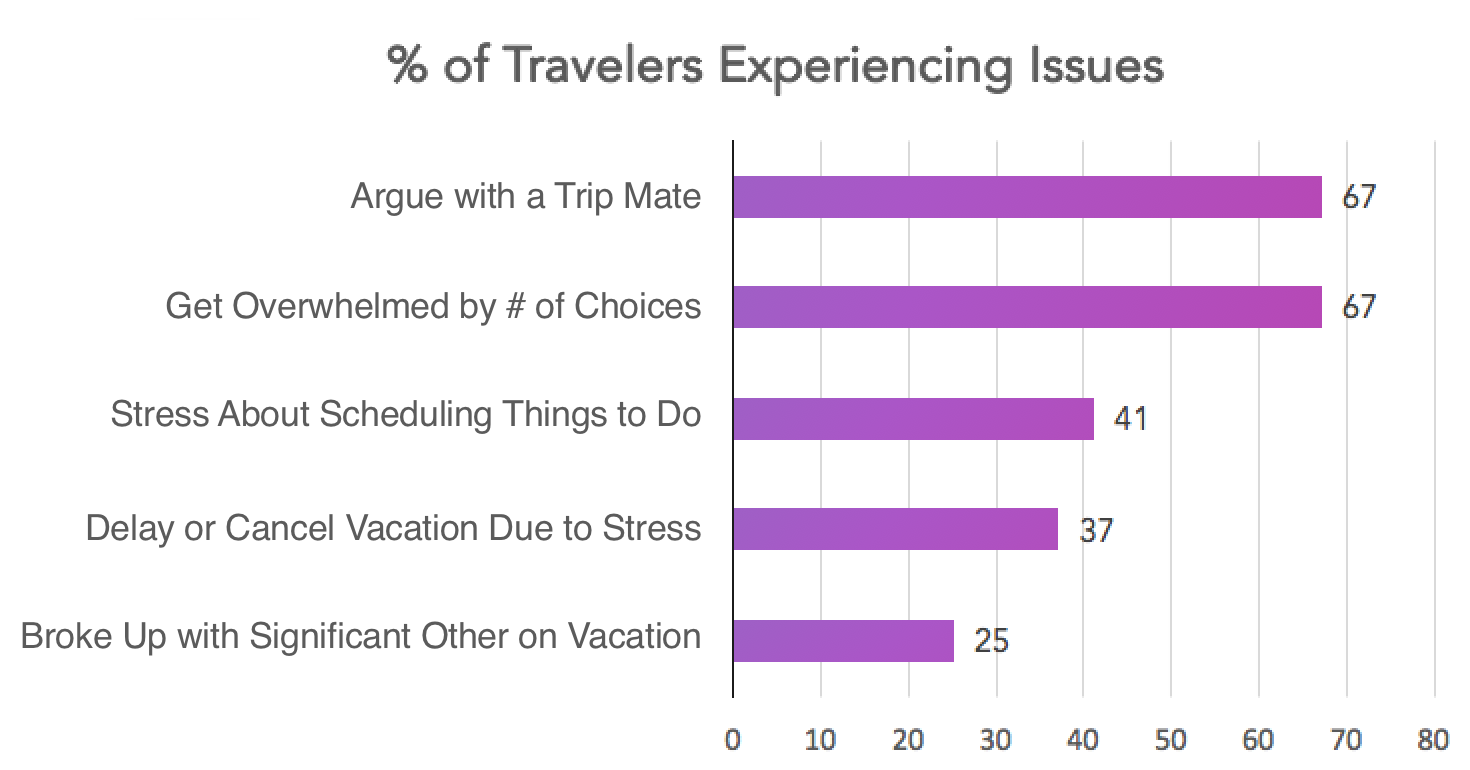
Secondary Research
I started with secondary research by searching for statistics related to travel issues. The following data was found.
Namely, the percentage of travelers who have argued with a trip mate and those who have gotten overwhelmed by choice were both at a whopping 67%. Stress was a big theme.
Primary Research
To get a better look at the overwhelm and trip arguments, I conducted a series of interviews with 5 participants between the ages of 20-40 who have traveled in a group before. The results were synthesized by arranging digital sticky notes on a board, as below. Information was categorized by behaviour, motivations, and pain points for each user.
Feel free to swipe left and right through the images below to view separate results for each participant, or click on the thumbnails below to zoom in.


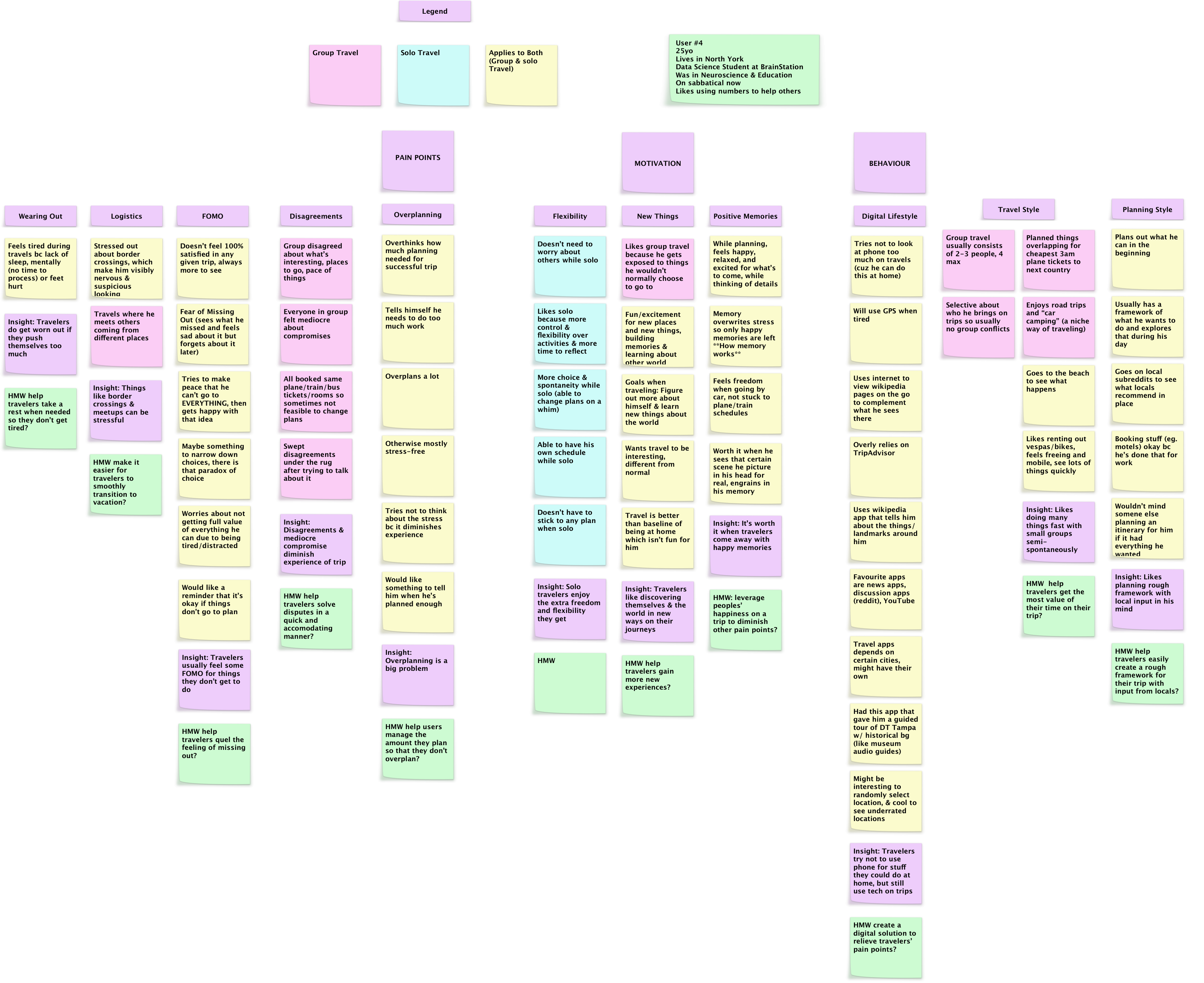

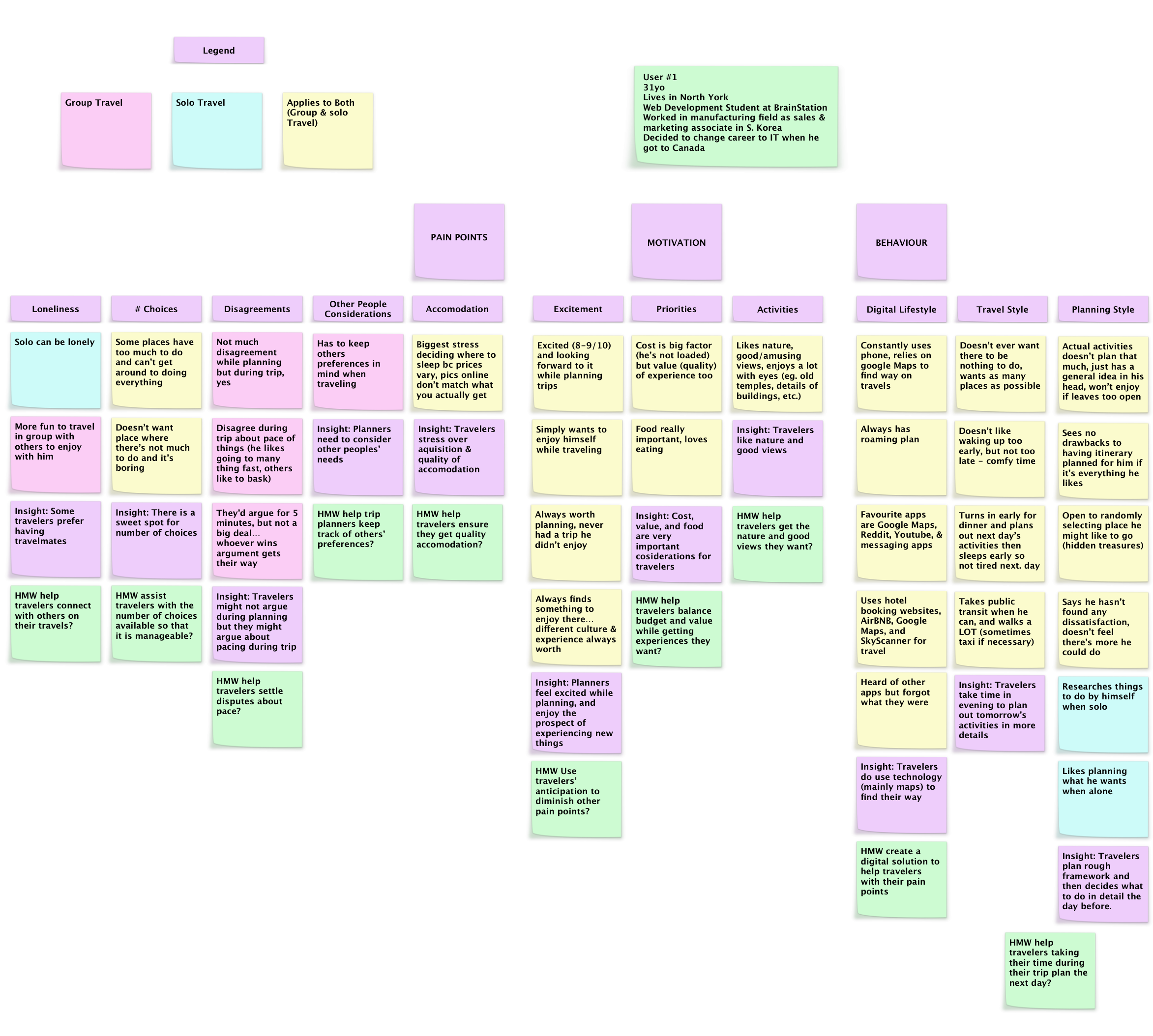
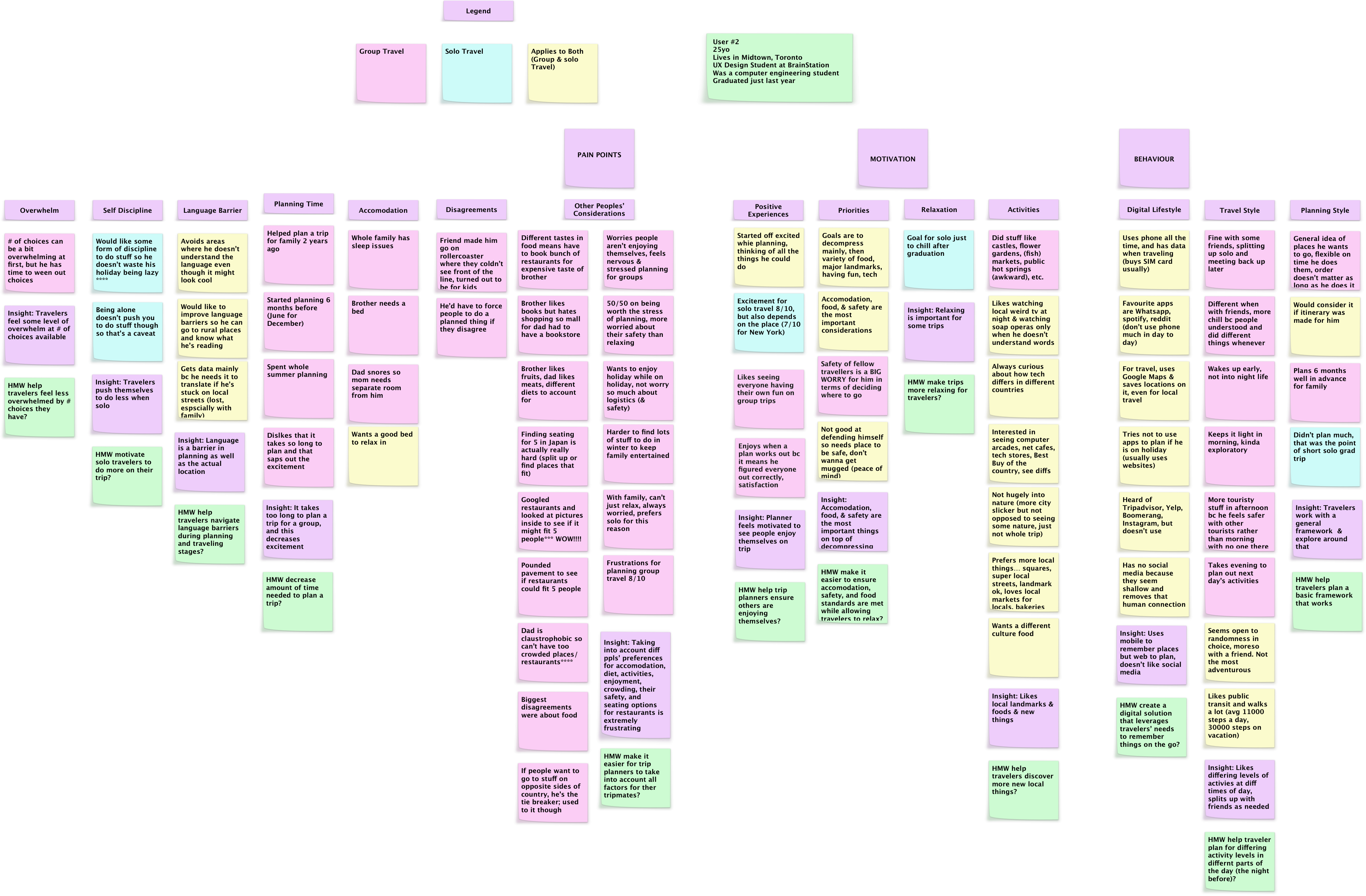
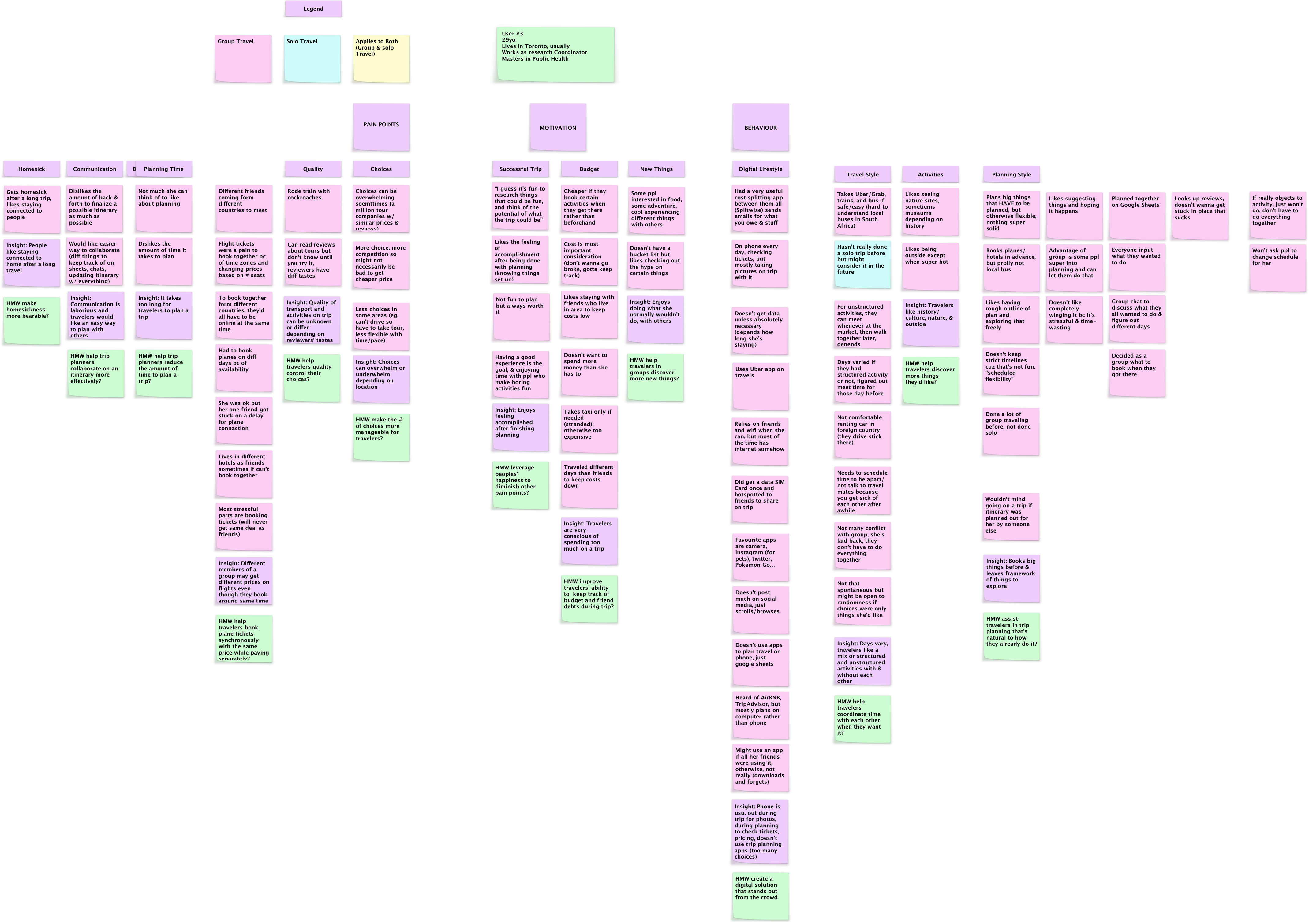

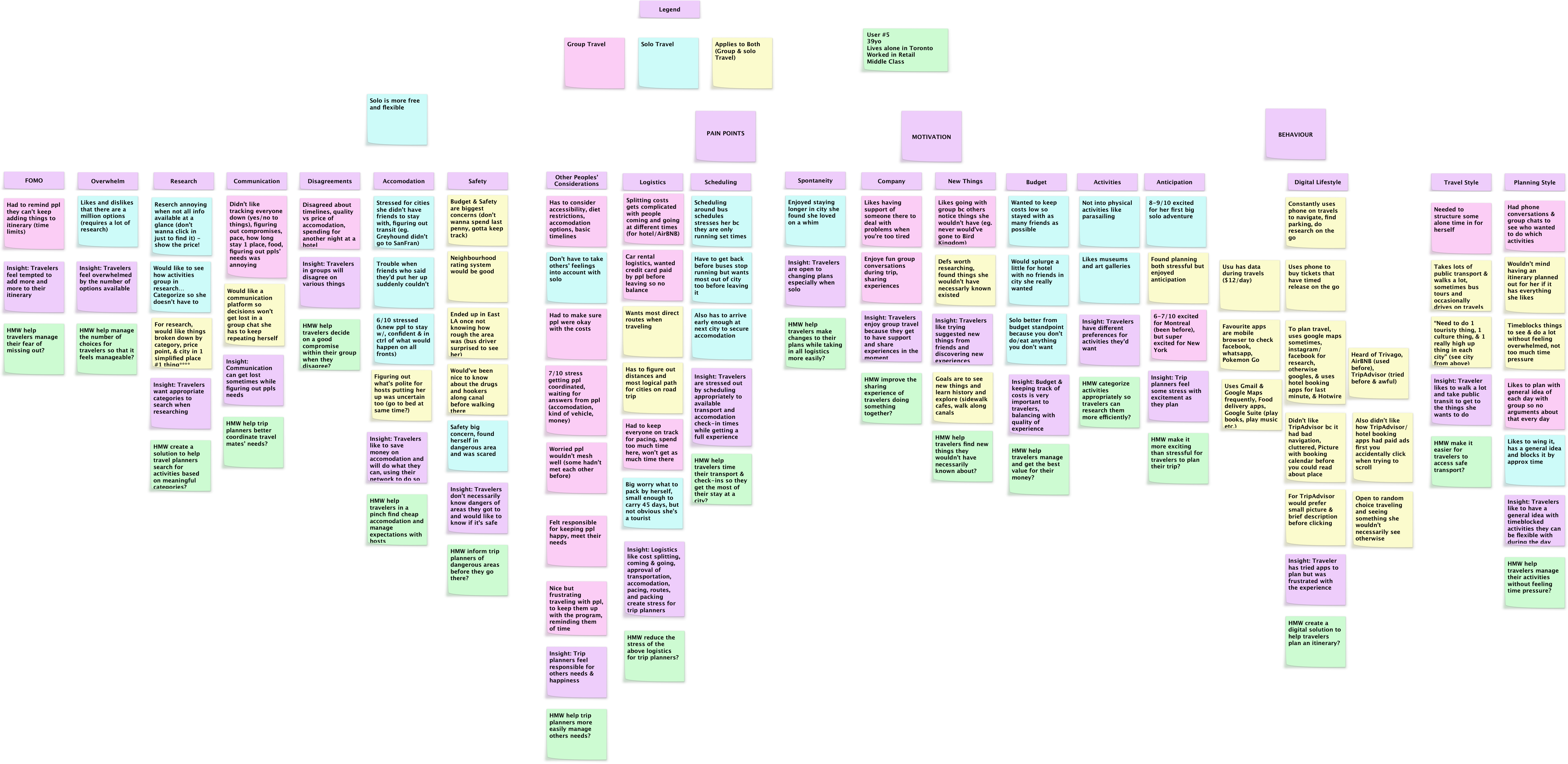
Key Insights
While many insights were had, I focused on the below as the main takeaways. The key learning here was that I am not my user. I found out I plan trips very differently from all 5 of my users and it was good to check my assumptions at the door this way. (I personally like to have all my activities scheduled first months in advance before thinking of booking anything.)
Behaviour
• Rough Outlines & Timeblocking
• Users emphasized need to know in advance what activities they'll do on trip
• Some roughly block out time for each activity
• Most don't like strict schedules
• Refinement of Plans During Trip
• Users spend time on trips planning out or reviewing details for the next day
• Booking First
• Users prefer to book plane tickets/hotels first before all activities are chosen
• They like having a sense of security in that regard
Motivation
• Enjoy Experiences with Friends
• Users like the different perspectives their peers bring
• They enjoy getting to do things they wouldn't have thought of

Pain Points
• Stress & Frustration Planning
• Users feel a non-zero level of stress (up to 8/10) planning group trips
• Reasons: Fragmented communication, and accounting for everyone's needs
• Main trip planners take on the most stress in the group
Using the above insights, I decided to focus on fragmented communication in making decisions on activities, as this seemed to cause the most frustration based on the way users elaborated on this issue.
How Might We
Decrease the amount of stress experienced by travelers due to fragmented communication while planning a group trip?
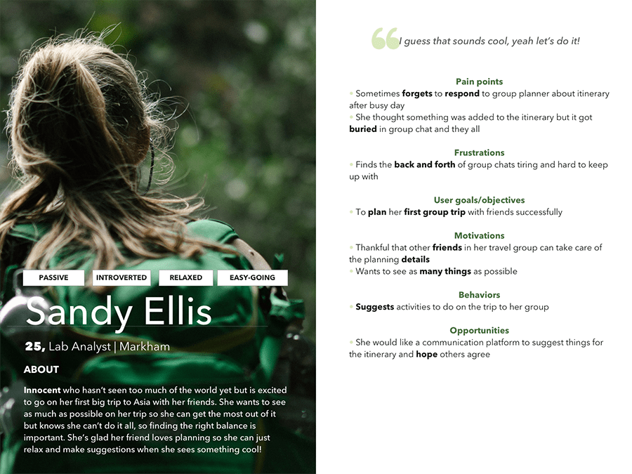
Personas
I used the above insights and "How Might We" to guide the creation of my primary & secondary personas, which would assist in making design decisions.
Meet Denise and Sandy.
One is acting as the main planner for her group trip.
The other is an easy-going participant.
I decided to design for the main planner as the primary persona because they seemed to experience the most amount of stress during the planning stages of a trip.
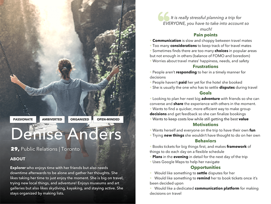
Other participants are crucial too so I wanted to keep them in mind throughout the process, as a secondary persona.
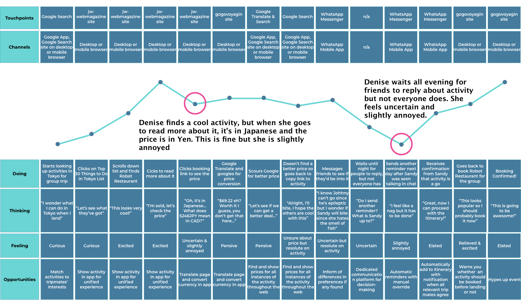
Experience Map
I created an Experience Map to identify key opportunities where improvements could be made for our persona, Denise. Namely, the communication portion, but also certain parts of the journey where the user may get confused while looking up activities in a foreign language or currency. I found the latter while going through this journey myself through a quick search on Google to get the most context and not miss anything.
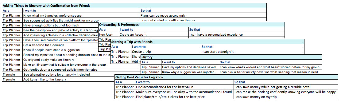
Task Selection
To organize behaviours and motivations, I created user stories using the below format:
"As a __________, I want to __________, so that __________."
I then categorized them into the epics shown below in light blue.
I chose to focus on adding things to itinerary as the primary task, and getting friend confirmation on activities as the secondary task, since this is directly related to the pain points of the personas.
Task Flow
To get a full picture of the user's journey through the task, I created a task flow diagram, as below. This helped identify and further refine key moments where design intervention could happen.

Sketching
Due to deadlines, I only had time to do one sketch based on the above flow, but could've ideated more on the process in different ways. Crazy eights sketches could have helped in creating lots of ideas in little time.
In this sketch, our trip planner, Denise, would land on the home page with a list of activities and be able to search for new ones and look at activity details, then vote with friends using a decision board and confirm.

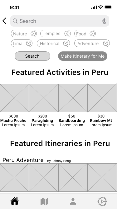
Lo-Fidelity Wireframes
These screens were based off the main actions in the task flow, where further refinements were made to create an itinerary with friends. I believe this is where I veered off-course, and the saying, "test early and test often" should have been applied. I am not proud of my round 1, but it was a learning experience the hard way, on how not to do things, as I will elaborate on below.
Mid-Fi Prototype (Round 1)
The first prototype is shown below; the user testing results were quite poor, so click through this at your peril!
I included a numbered guide to show what's happening and some key learnings below.


Round 1 User Testing Results
The results were not good, as detailed above and in the below summary. There was much to learn, and much to do. This was a literally pivotal moment, and I had to rise up to the challenge!
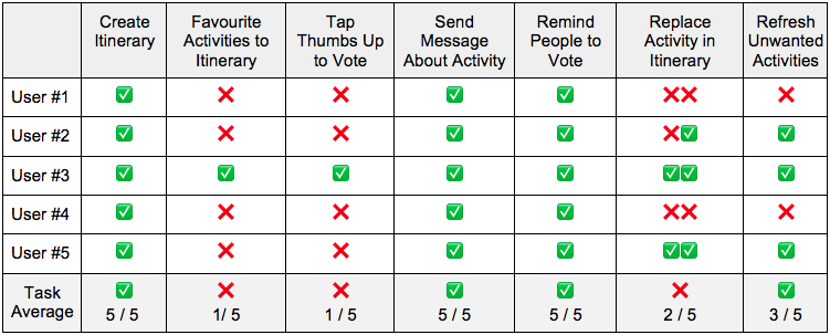
Summary of Learnings from Round 1
I did some ammendment to the task flow and "order of operations" so to speak while I was going into mid-fi, and the outcomes showed that this process was rushed and not inspired enough. The below is what I learned from this.
• Don't rush into wireframing without fully planning it out
• Do more inspiration finding first to find UI patterns that work
• Don't work in a silo, get feedback (this was crucial in Round 2)
• Try to space things out more so users don't feel claustrophobic
• Try to focus more on one issue, not every single issue brought up in the interviews
Round 2 - Thoughts
It was back to the drawing board, literally. But I was determined to make something work, while taking the few things that did work from the first iteration. I took some time to just look at inspiration and draw out ideas on pen and paper, which really helped. In addition, getting feedback during the process really helped me too as a designer, to know which direction to go forward with. I gained some insightful design advice which will help me going further to avoid having everything crowded, and just letting things breathe. Scrolling is a very familiar pattern to people, and I have learned my lesson the hard way. Some design decisions may have been influenced by my own biases and the way I personally do things, but I listened to my users during the testing and removed features that weren't useful, or even caused anxiety for them.
Round 2 - Sketches
I did a full day and a half of sketches, taking my time to research and improve my task flow and UX patterns with feedback to get everything as clear as possible. They are shown below. I learned a lot about basic flows that are familiar to most users and that it's okay to copy. You don't have to reinvent the wheel, and I proceeded with this in mind.
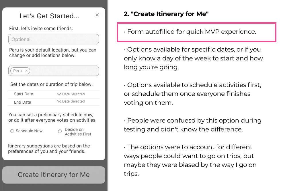
Onboarding
I started by making an onboarding flow, to give the users context into why they were being dropped into a Peru itinerary page. At this point, I was still somewhat in the mindset of solving every problem and logistic for the user, so things like diet were being taken into consideration. Vegetarian? Well, we will only recommend vegetarian restaurants for you! (This was the wrong approach as I will detail later.)
As well as the basics, such as where you want to go on your trip, who is coming with you, and the dates you want to go. I included an option here for how long they want to go and which day of the week they want to start in case the user didn't have an exact date yet.
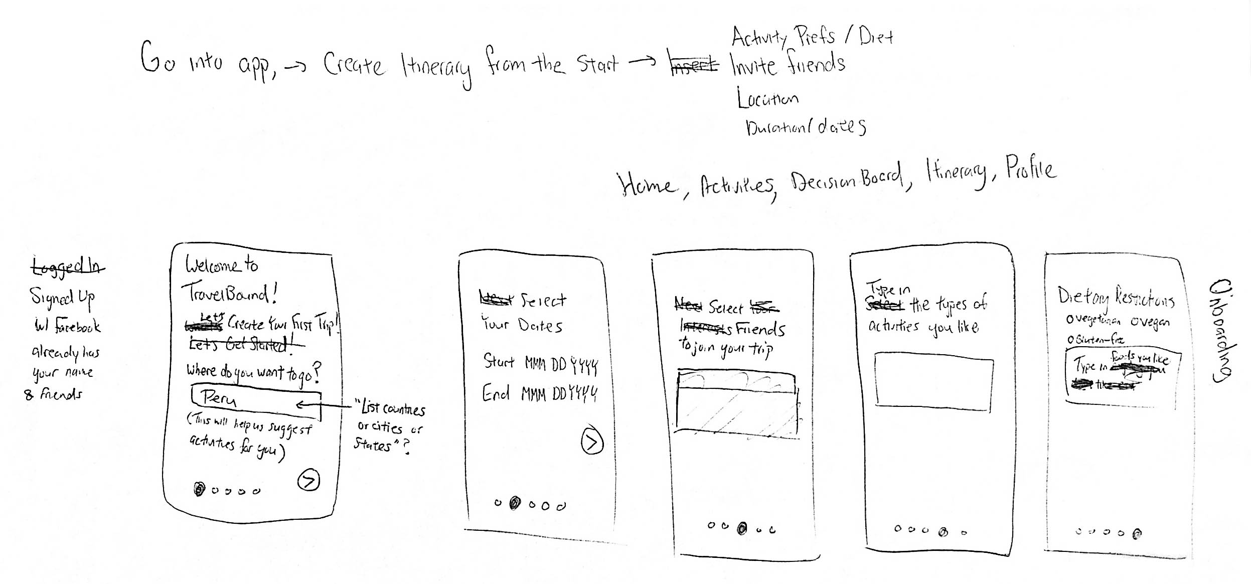
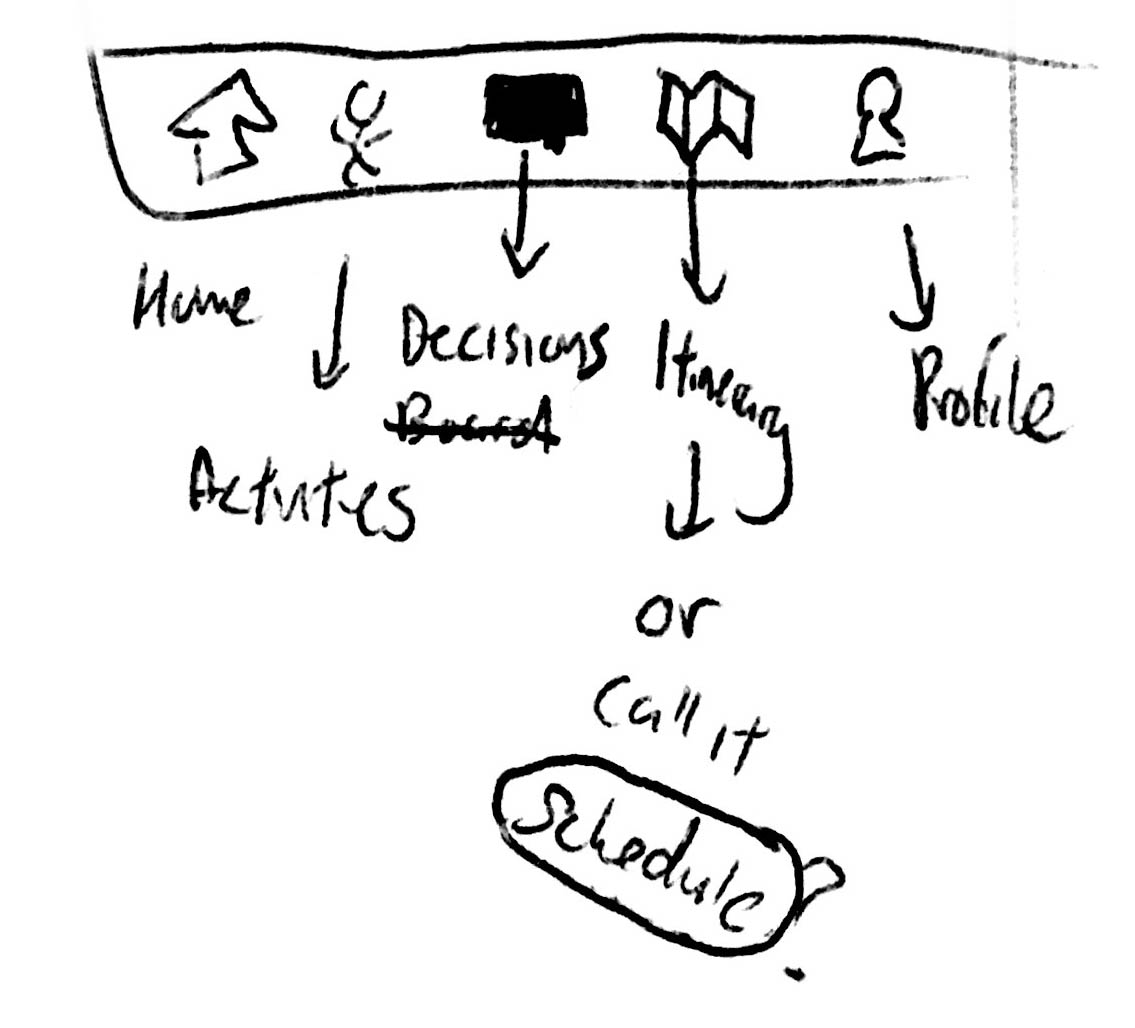
Tab Bar
The tab bar was redesigned based on the most useful functions arranged from left to right in the "order of operations" needed to complete the task flow easily.
Based on user testing, there was some debate whether to call the fourth tab "Itinerary" or "Schedule" since people thought the list of unscheduled activities were already an itinerary. Decided on schedule for now because of that.
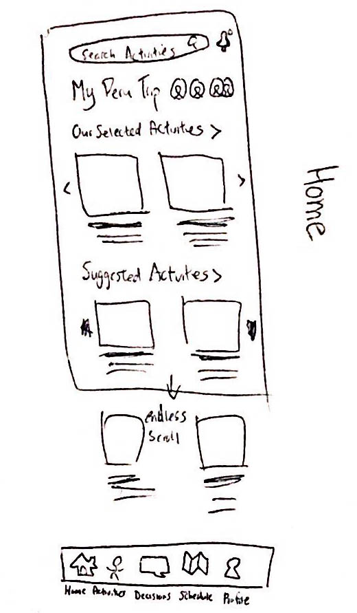
Home
Next, the home screen was redesigned, using feedback from users that the original screens were too crowded with 4 photos in one row. People could barely make out some of the photos so I made them into rows of 2 photos, which seems to be a common pattern in mobile apps.
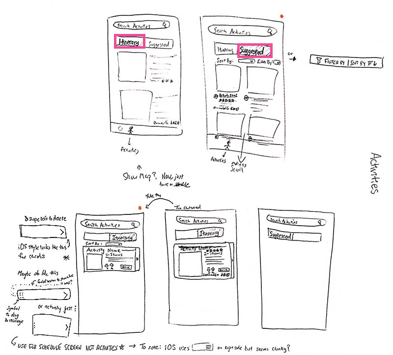
Activities
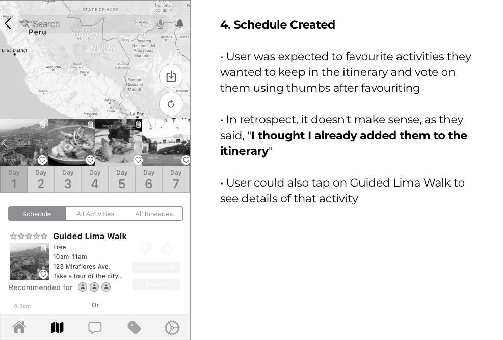
I relegated making the itinerary/scheduling to after people picked activities, since that seems to be the option users gravitated to most often during testing. The cards for the activities were rethought too. Patterns were found to signify that cards could be rearranged from most to least favourite. Filter and sort patterns were also researched for the activities page.
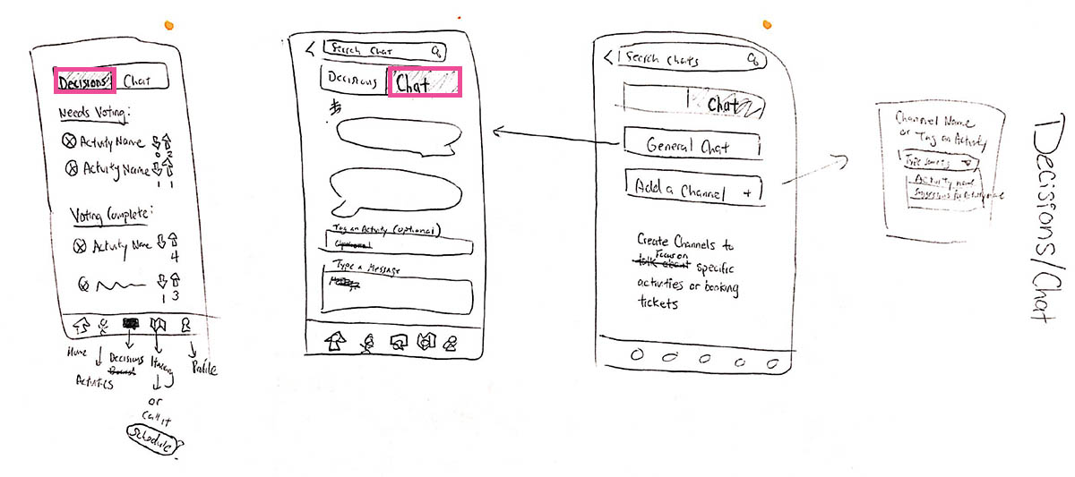
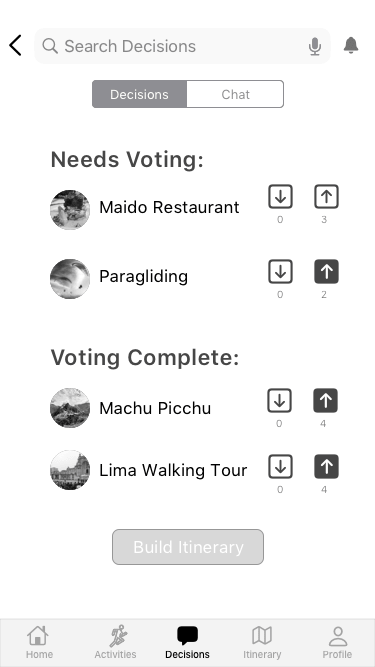
Decisions/Chat
During testing, when users were asked how they'd remind their friends to vote, they gravitated towards the message button. So I decided to integrate chat and decisions into one tab, where users could tag others about specific activities and have a focused place to vote on them.
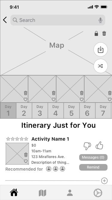
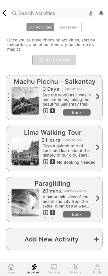
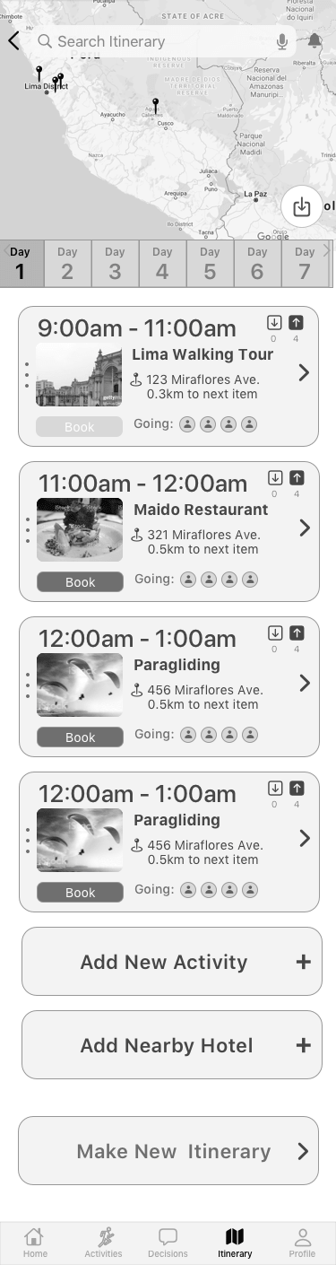
Itinerary/Profile
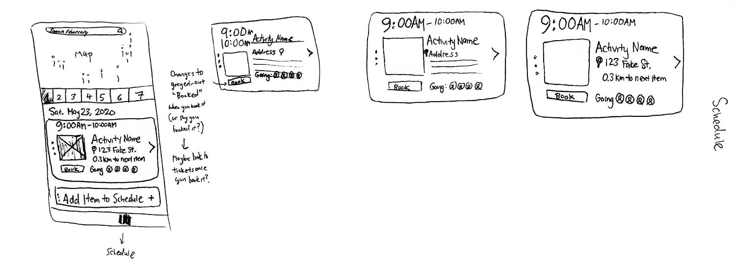
Users liked the map and the days function at the top so I kept those, but the carousel of photos was questionable so I removed it. The cards were redesigned to showcase the most important information and functions in visible spots. People may book before or after so I kept the booking option to remind users in case they forgot to book anything. During a trip, the most important thing is knowing where you're going next and when, so I made those prominant. It may also be useful to know who's going with you if you're splitting up, so I included that too, and pictures to keep the visual interest.
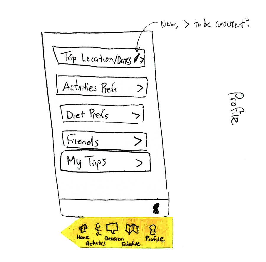
Profile
I added a profile section at the end where the user could select from a number of options and change their settings and preferences.
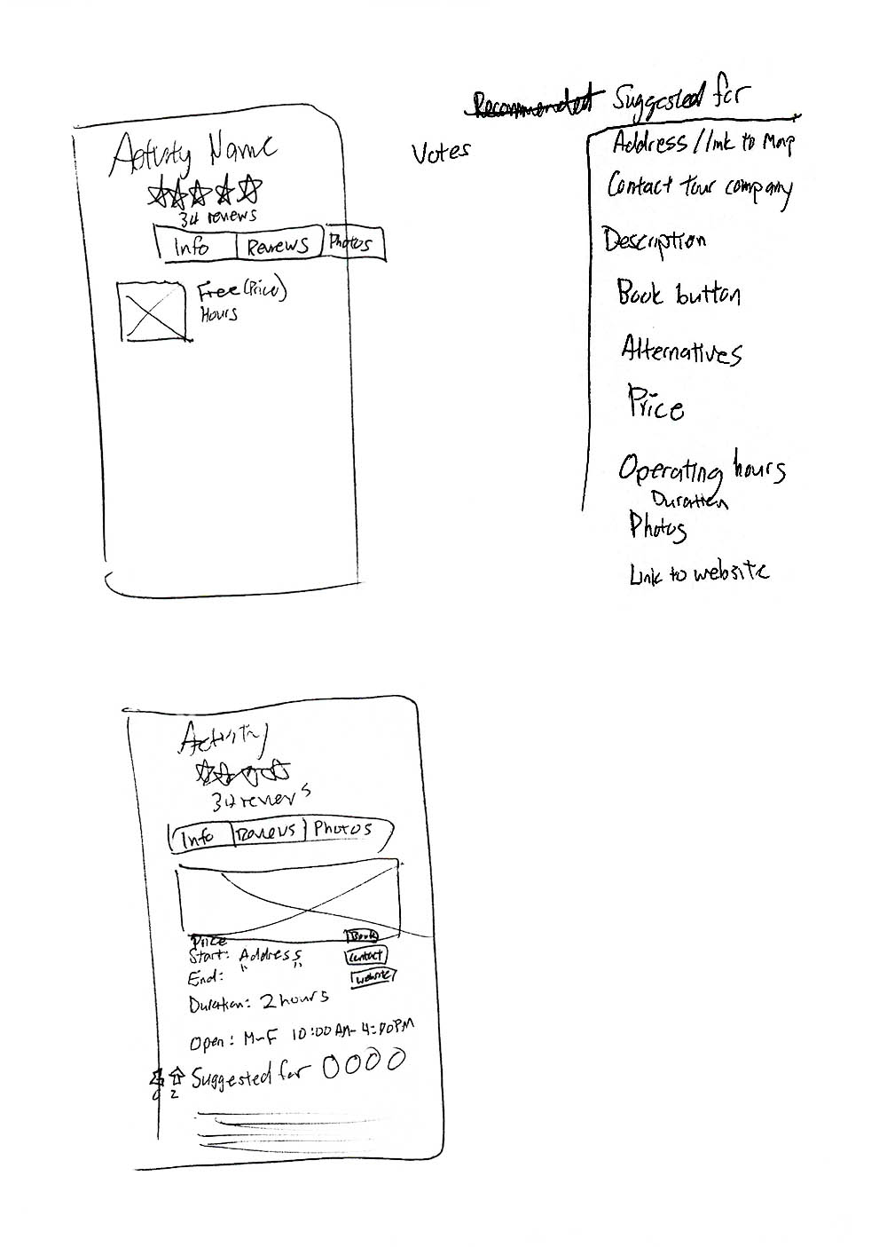
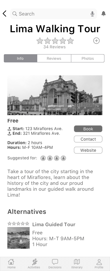
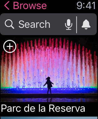
Activity Details Page
I redesigned the activities page first by doing research on competitors like TripAdvisor, and then making a list of everything that should go on the page. Then, I arranged them in a way that might make sense on paper.
Paper Prototype (POP by Marvel)
I put the paper sketches into the POP app by Marvel (shown below) and tested it out on some designers. They seemed to get through the task flow much easier than users in the first round of testing, so I took this as the go-ahead to proceed onto digital wireframing! I did remove the Dietary Restrictions as users seemed to find it weird to have this there.
Before
After
For Home Screen
● Pictures & text bigger
● Spaced out pictures
● Removed featured itineraries since it confused people
● Using + button to add to Our Activities instead of heart

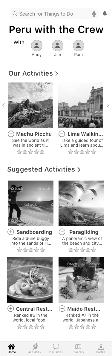
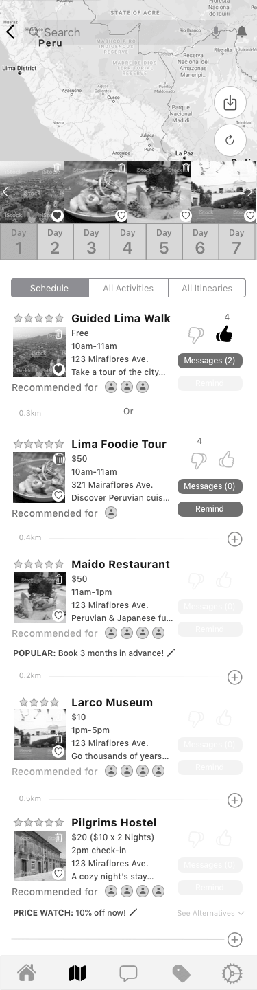
Our Activities Page
● Designed page to view all activities added by friends
● Can see details, vote, book, view suggestions
● Creates itinerary once all activities are voted upon
Before
After
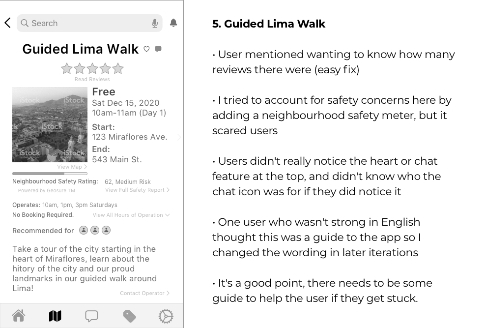
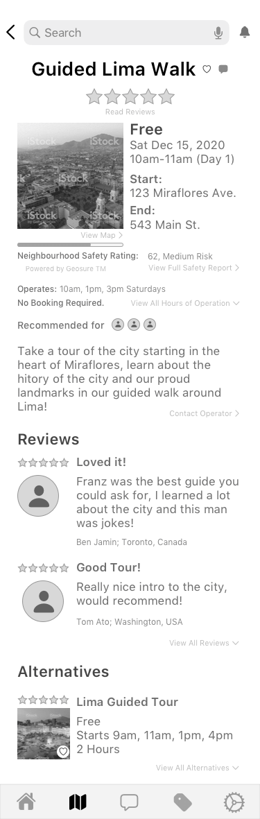
Activity Details Page
● Removed safety rating
● Put reviews on another tab like
TripAdvisor has it
● Added photos tab
● Made layout more flexible (no need to fit long addresses in cramped space beside photo
● Added buttons to book, contact operator, and go to website
● Users could see details of activities, vote, and book
● From here, you could organize by favourites, then create itinerary/schedule once everyone votes
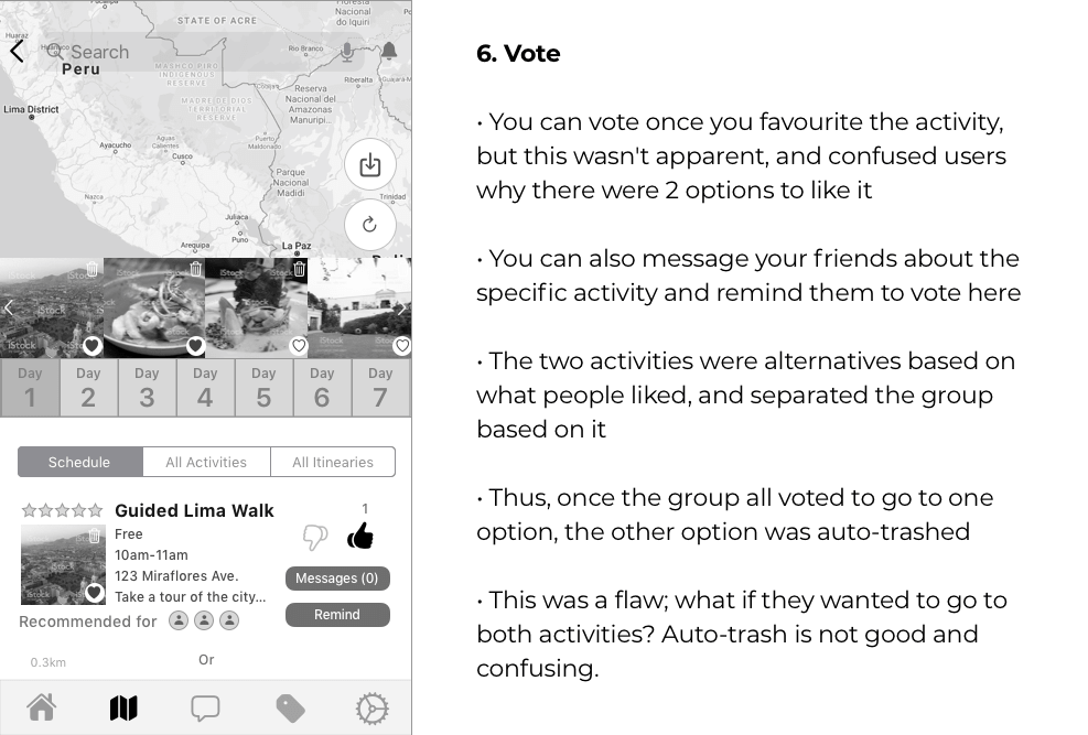
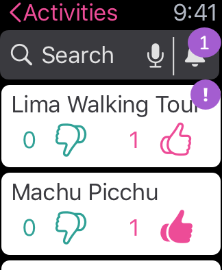
Decisions Page
● Designed a decision board and chat system with channels like Slack to talk about activities focused and a general chat where you can tag activities
● Added a focused decision board where users could see what else needed to be voted on by themselves or others
● Changed thumbs up to up and down arrows to upvote and downvote like Reddit
Before
After
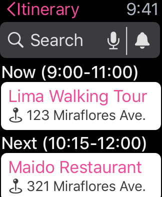
Itinerary Page
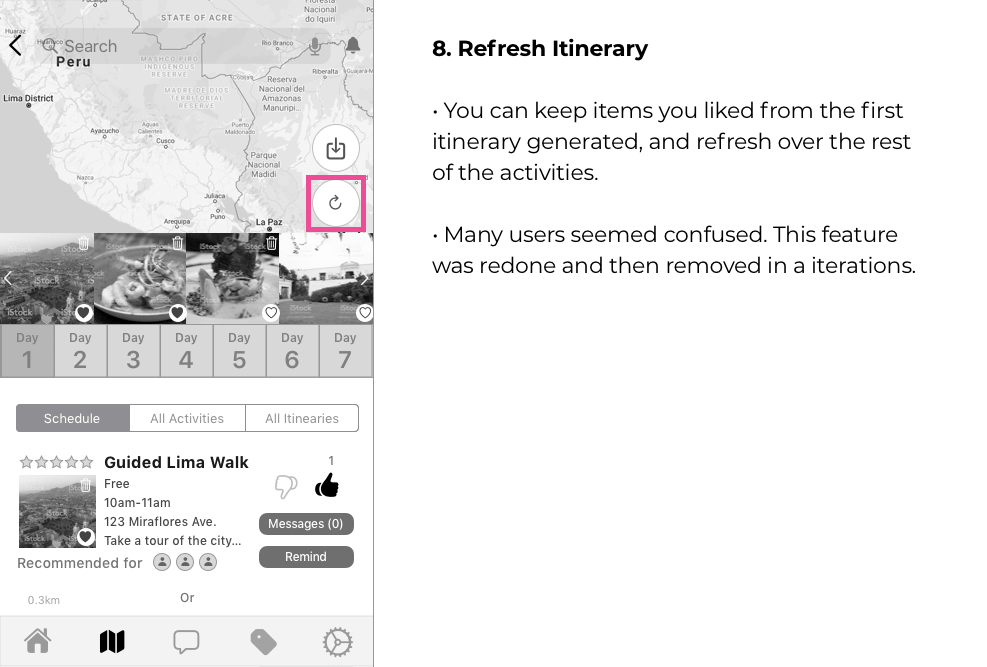
● Removed carousel above days
● Made times more prominent to make it clear it’s a schedule
● Rearranged elements to make it cleaner
● Removed Remind and Message buttons
(people can use the chat function as they did in tests to do this, and tag the activity)
● Moved refresh function to bottom
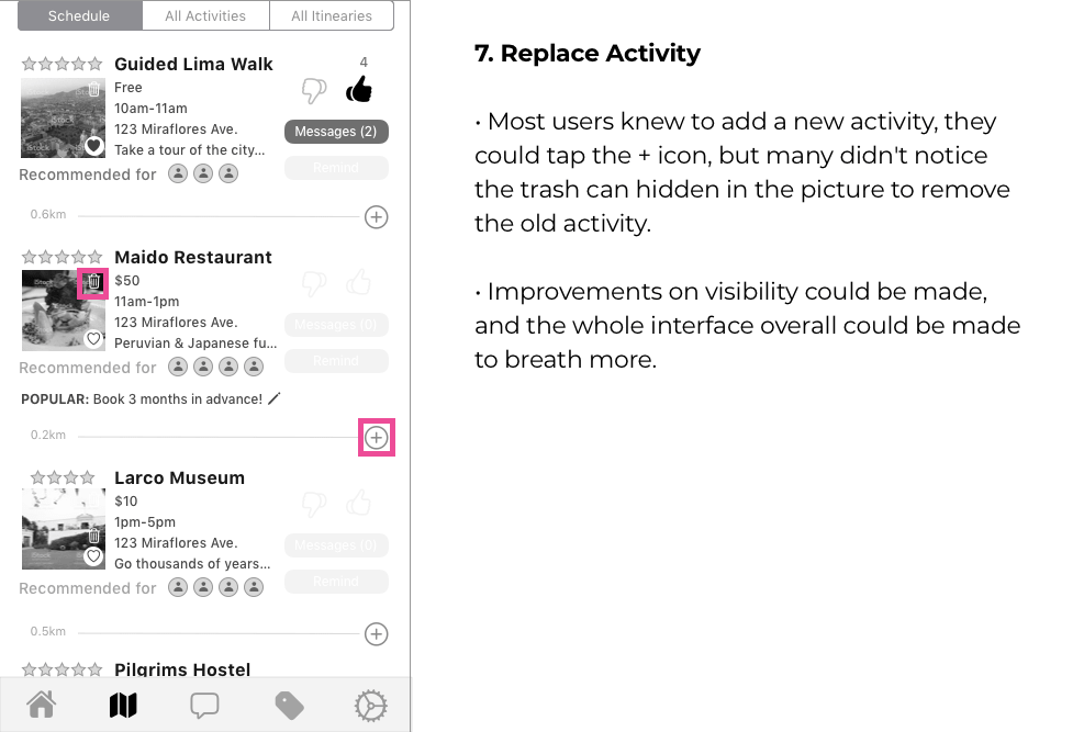
● Add activity button at bottom instead of every line
Profile Page
● Added profile screen with context of how matches to activities could be changed
● My trips section added to switch over to a different itinerary
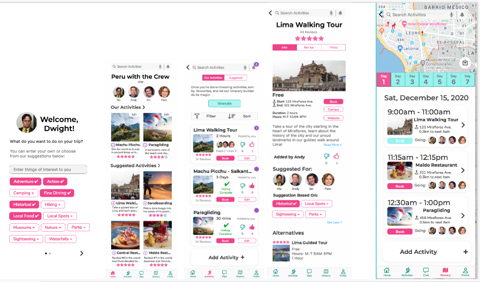
Round 2 Prototype
All screens from the Round 2 prototype can be viewed below.
Round 2 Results
All that work paid off; this round of testing went much better! Just a lot of people didn't see the chat now, so I will have to make some minor tweaks and do another round of testing to validate the changes before going into high-fidelity. The tasks people failed on was voting on the activities page because they didn't see the buttons, or because they didn't recognize them as being for voting. Also, based on reactions, it seems having the dedicated voting is not as useful, and should be merged with the activities tab. The Decisions tab can then be relegated to just being a chat tab. Having dedicated functions is important, and maybe decisions and chat aren't too great together in the same tab. A third iteration is definitely needed before proceeding based on these results.
Round 3 Prototype
The above-mentioned changes were made for the third iteration, which can be clicked through below. In addition, the onboarding flow was tightened up with better UI patterns. Changes were made concurrently to assigning colours based on deadlines so users were told to ignore the colours and focus on the tasks. Testing was done rapidly with two users who were available at the time, and both passed all tasks without much prompting or questions on my end. They were able to explore the app, and commented on how simple it was. There were some comments about the functions included in the edit button, but the core task was pretty solidified.
Visual Identity Exploration
Words used to describe the app were first defined as below:
● From Interviews: Fun, Exciting, Anticipating, Looking Forward, Together
● Other Words: Bright but not blinding, Popping but not in-your-face, energetic, happy, vibrant
Mood Board
The following pictures were chosen to represent the words listed above and colours were extracted from this to make our brand colours.

Brand Colours
The following brand colours were chosen from the above board, based on their vibrant, fun nature.
Colour Palette
Some other colours were added to the palette to balance out the vividness with some neutrals and to define some functional colours as well.

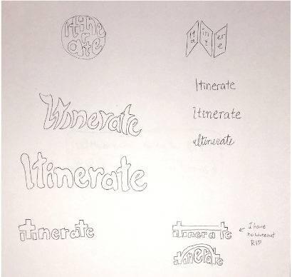
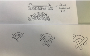
Wordmark Exploration
Some fonts were researched and sketchs were done to explore relationship of letterforms. A globe was done to communicate connection to the world, and a map, some different letterings, and using the 2 t's to connect as a bridge. The printing, italic, and cursive writing were done as a warm up.
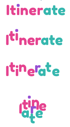
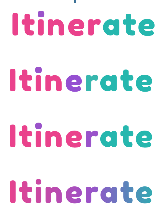
I played around with the Fredoka One font, which I got feedback on as a good playful font from a graphic designer. I did different things with colours, heights of letters, arrangements, and spacing. People liked the gradient the most so it stayed.
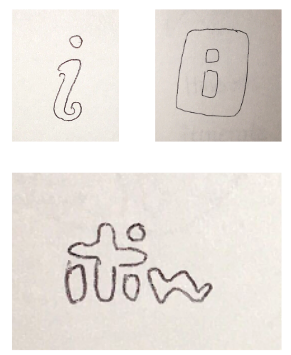
Icon Design
I got some inspiration for my icon/logo drafts from the bridge in my wordmark exploration, but also from inspiration finding around existing apps.
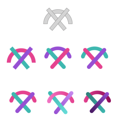
App Icon
3 gradients were tried and feedback was received that the last one was the best, so I went with it.

Colourized Screens
These were done a little before the gradients were tried, so solid colours were emphasized more in the app. You already knew this and might have clicked through this prototype above, but just in case!
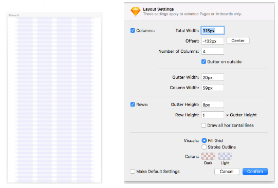
UI Library Stuff
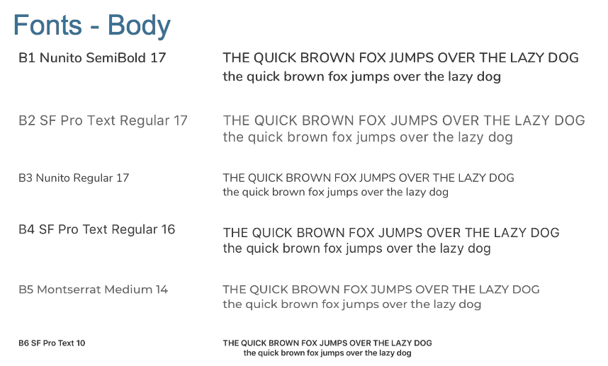
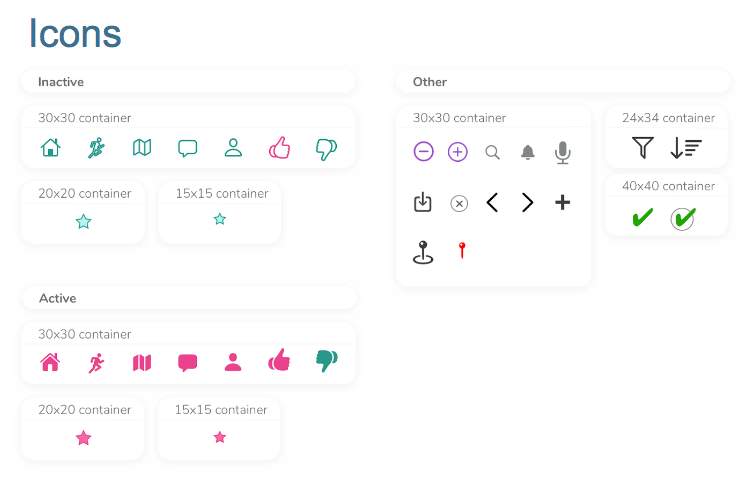
Here are the grids used, with vertical spacing done at intervals of 8px if possible, as is the convention. The typefaces used within the app are Fredoka One, Montserrat, Nunito, and SF Display Pro. The icons are displayed below too. I chose fonts based on pairing tools onthe internet, and icons were kept as close to iOS standards as possible.

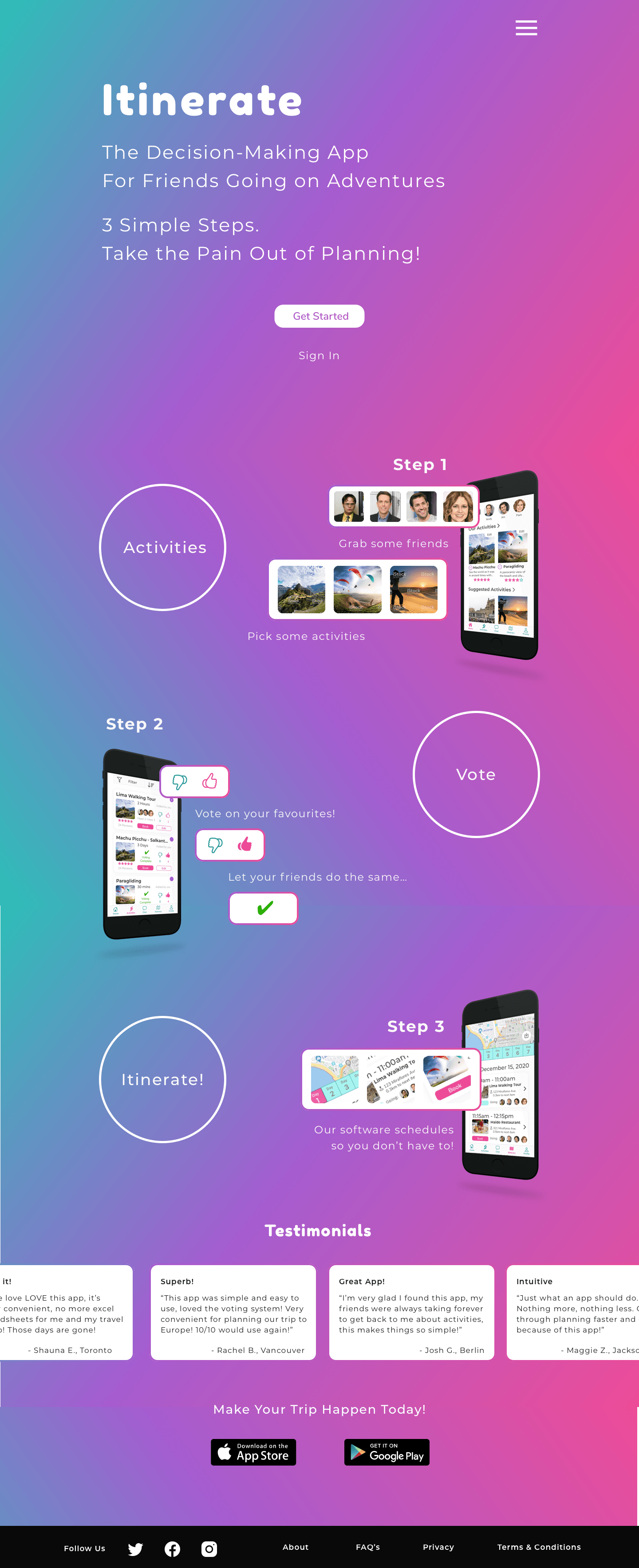
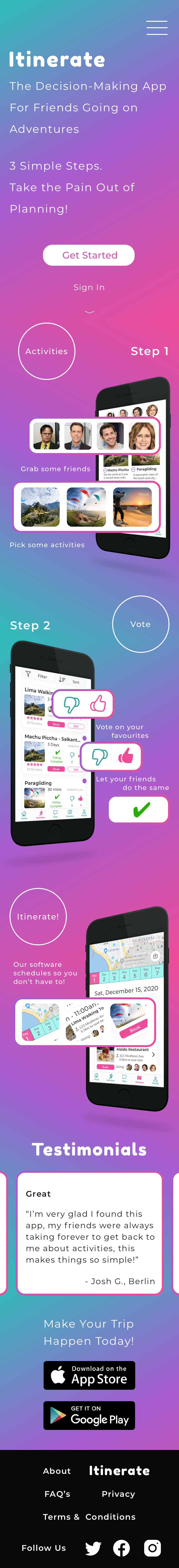
Marketing Website
We were tasked with creating a responsive marketing website for our mobile app, viewable on web and on mobile. Here they are! I experimented with the gradients, and the movement of elements to follow the movement of the gradient for visual effect. Copy was played with too to maximize engagement and investment in the app. More may need to be done in order to maximize emotional response to the problem the app is solving though.
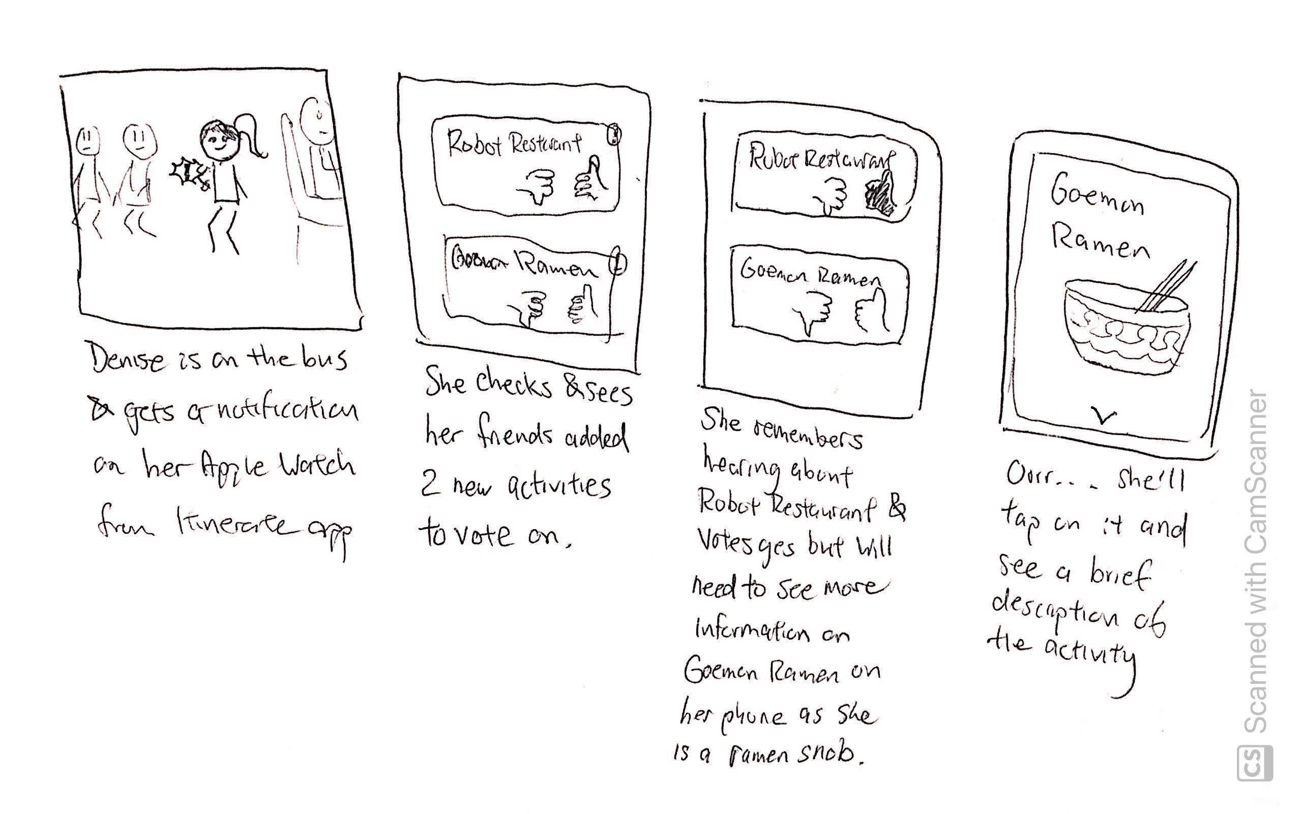
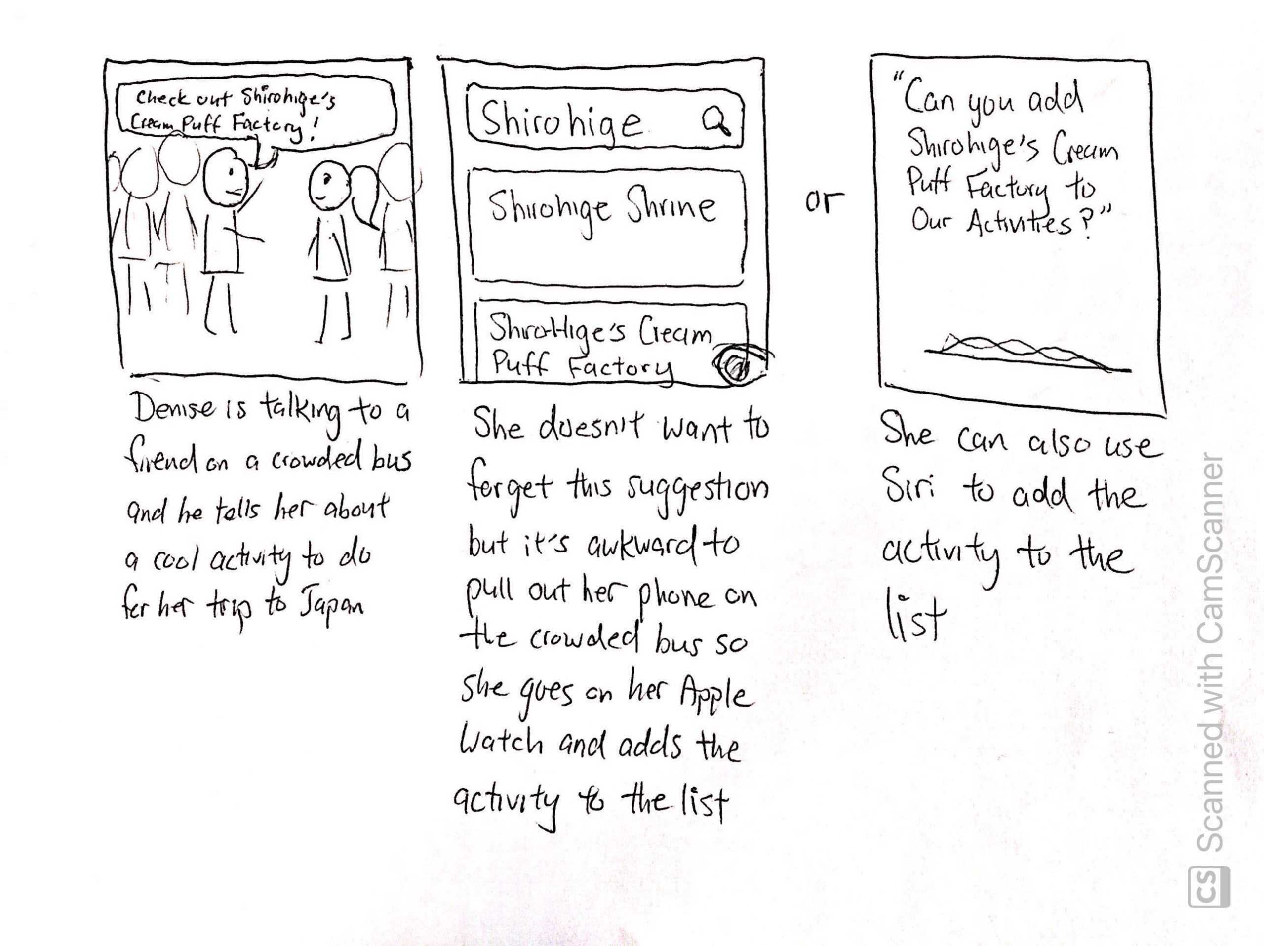
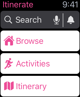
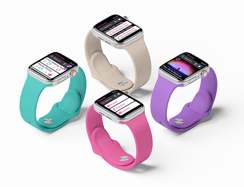
Apple Watch
We were also tasked with creating a version of our app on an alternative platform. I chose the Apple Watch based on some storyboarding I did on use cases. It seemed logical to do on this platform at least. I did some research on how the UI patterns went on the Apple Watch, and amended my designs as I went, then placed the screens on mockups. This was done within a day.

TAROT CARDS OF TECH
The Tarot Cards of Tech are used to explore the future impact of a technology, from the good, the bad, to the ugly. Below, I have considered 3 of them.
The Catalyst: This could bring about change in the way people socialize, and make decisions revolving group activities in general. People may become more spontaneous and culture would shift towards being more fearless in social interactions.
Video Killed the Radio Star: This could eliminate the use of somewhat more cumbersome methods like Excel to plan trips, though Excel is still pretty powerful for a lot of other things... Actually, I could see this putting travel agencies more in the red.
The Scandal: This app could be used in culturally insensitive ways to encroach on cultures in locations where they prefer to be left alone. Certain attractions, especially natural ones, could become more crowded, and as a result, become trash grounds, or worse.
So in conclusion, we must be careful with tech, but bad things happen using any medium, people will find a way. We can try to safeguard as much as we can though, while driving positive social change.
I learned a lot during this project, with respect to the process, and I respect the process a lot more now, having gone down the rabbit hole of doing it wrong. It's been a ride!
That's all I have for now, but please feel free to connect with me to talk about my designs, or anything, really!
Selected Works
Itinerate (2020)Trip Planning (iOS, Apple Watch)

Eagle Care Health Solutions (2022)Website Creation / User Interviews / Usability Testing (Desktop, Mobile)

Yelp (2020)Heuristic Redesign (iOS)